Tuesday, 16 April 2013
Connecting to our Audience
In order to connect with our audience we have used social networking sites such as Facebook and Twitter, this helps us to share our film opening with a larger audience and gain feedback...
- https://www.facebook.com/shutterfilm
- https://twitter.com/ShutterFilmZon
Monday, 15 April 2013
Editing difficulties
When editing out footage we found a number of elements difficult however there were two in particular aspects that caused us the most trouble;
2. Sound:
On the days we decided to film there were high winds meaning the vast majority of the sound was low quality and un-useable. There was also a lot of background noise in some of the clips that we didn't want. In order to get rid of this we decided to mute the vast majority of the clips and add sound effects over the top. We chose realistic sound effects off iMovie and faded them in and out so that they appeared to belong. This element of the editing was very difficult, however once achieved it vastly improved the overall quality of our film opening.
- Colour Matching:
2. Sound:
On the days we decided to film there were high winds meaning the vast majority of the sound was low quality and un-useable. There was also a lot of background noise in some of the clips that we didn't want. In order to get rid of this we decided to mute the vast majority of the clips and add sound effects over the top. We chose realistic sound effects off iMovie and faded them in and out so that they appeared to belong. This element of the editing was very difficult, however once achieved it vastly improved the overall quality of our film opening.
Sunday, 14 April 2013
Peer Feedback
After producing a final version of our film openings we held a meeting in which a number of groups, including ours, presented their films. For this occasion we created a simple questionnaire in order to receive some peer feedback on our opening.
From this questionnaire we received some very positive and useful
feedback.
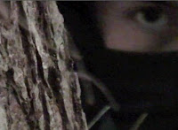
Having looked at all the questionnaires we got handed back to us we generalised all the comments and found that overall our sub-genre (psychological horror) was clear to the audience. We were also told that the music was appropriate and fitted the opening. Everyone stated that our plot was believable and that the setting and location choice was fitting for the type of horror we were trying to create. The majority of the feedback we received stated that the slow motion turn in the tunnel and the end shot of the villain's eyes were the most successful elements of our opening. In general the only negative feedback we got was about the hug goodbye between the two characters and the dialogue as some people felt it seemed slightly awkward and forced, however we decided that it would be most beneficial for us to keep that element as it was, in order to ensure the continuity stayed at a high quality.
Overall we got really positive feedback about our film opening and we were very happy with it.
Saturday, 13 April 2013
Shutter (Final Cut)
This is our final cut of our horror opening 'Shutter' we have made improvements that were advised by other group members...
- Soundtrack
- Sound clarity
- Credits
Overall we are pleased with our final piece as we feel that we have achieved a psychological thriller in our opening.
Friday, 12 April 2013
Credits
For our credits I used a font called 'momstypewriter' I felt it gave an effect that complimented the theme of a photographer, I took inspiration from the intro of Se7en (1995) which used a typewriting front effectively to match an eerie unknown figure taking clippings and creating a scrapbook of sinister images.
http://www.artofthetitle.com/title/se7en/
http://www.artofthetitle.com/title/se7en/
Thursday, 11 April 2013
Our Horror Soundtrack
This is the Soundtrack we used for our film opening...
The soundtrack had to create suspense and build up tension, this helps amplify the movements on screen and keep the audience immersed in the atmosphere. I used the soundtrack to "Jaws' by John Williams to get inspiration and focus on elements that make it effective. The steady increase in pace and volume heightens the tension and gives the affect of a oncoming 'doom'.
Wednesday, 10 April 2013
Sound for our film
For our opening there are certain sound effects we need to add depth and atmosphere, I searched the Internet to find ones that suited the requirements.
I used a website called freesound.org that provided a variety of sound clips...
I used a website called freesound.org that provided a variety of sound clips...
- School Bell - http://www.freesound.org/people/foxen10/sounds/149023/
- Thunder -http://www.freesound.org/people/chrisw92/sounds/159684/
- Camera - http://www.freesound.org/people/eklee/sounds/142906/
- Camera Zoom - http://www.freesound.org/people/sheepfilms/sounds/154795/
- Bushes Rustling -http://www.freesound.org/people/j1987/sounds/106114/
- Creaking Trees - http://www.freesound.org/people/ERH/sounds/33256/
Tuesday, 9 April 2013
Interim evaluation
 After having completed our first cut of our film opening we noticed a number of things that we are not entirely happy with and want to change. Firstly we decided that we want to replace the logo at the beginning as it looks out of focus and unprofessional. A second element we decided
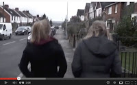
  to replace is the film name at the end, because it doesn't capture enough attention and is a bit plain. We also noticed that the sound isn't particularly high quality and the continuity is bad so we plan to add in sound affects and mute certain tracks to fix this. We also feel looking at the first cut that we would greatly benefit from a soundtrack to ensure attention is captured and held and to aid the build of tension. Our first cut is also a few seconds too long so we have decided to cut the scene of the girls walking down the hill. We though
 this would be the best scene to cut as the filming is unsteady and has an amateur feel to it. A further element we noticed that needs adjusting is the clips in the woods at the end. These were filmed on a different day to the rest of the footage and therefore there is quite a noticeable colour difference between some clips, affecting continuity. In order to get rid of this we will need to adjust the colour on the clips in iMovie. Finally we need to add in credits in order to meet the specification for our film opening.
Monday, 8 April 2013
Sunday, 7 April 2013
Raw footage
This is the majority of our raw footage we shot. We selected elements from all of this to include in our final film opening.
Saturday, 6 April 2013
Friday, 5 April 2013
Thursday, 4 April 2013
Wednesday, 3 April 2013
Costume Planning
Kira (main character):
White top symbolises innocence and purity. Casual clothes makes her relatable to the audience. Hood needed for thunder scene.Typical clothing worn by teenager to emphasise the young age.
Emily (friend):
Casual, every day clothes to make her relatable to the audience and appear as an every day teen.Coat on to emphasise bad weather setting the atmosphere.
Oliver (stalker):
All black clothing worn symbolising danger and death. Virtually all skin covered to emphasise anonymity and unknown identity.
Tuesday, 2 April 2013
Monday, 1 April 2013
Subscribe to:
Comments (Atom)


