Tuesday, 16 April 2013
Connecting to our Audience
In order to connect with our audience we have used social networking sites such as Facebook and Twitter, this helps us to share our film opening with a larger audience and gain feedback...
- https://www.facebook.com/shutterfilm
- https://twitter.com/ShutterFilmZon
Monday, 15 April 2013
Editing difficulties
When editing out footage we found a number of elements difficult however there were two in particular aspects that caused us the most trouble;
2. Sound:
On the days we decided to film there were high winds meaning the vast majority of the sound was low quality and un-useable. There was also a lot of background noise in some of the clips that we didn't want. In order to get rid of this we decided to mute the vast majority of the clips and add sound effects over the top. We chose realistic sound effects off iMovie and faded them in and out so that they appeared to belong. This element of the editing was very difficult, however once achieved it vastly improved the overall quality of our film opening.
- Colour Matching:
2. Sound:
On the days we decided to film there were high winds meaning the vast majority of the sound was low quality and un-useable. There was also a lot of background noise in some of the clips that we didn't want. In order to get rid of this we decided to mute the vast majority of the clips and add sound effects over the top. We chose realistic sound effects off iMovie and faded them in and out so that they appeared to belong. This element of the editing was very difficult, however once achieved it vastly improved the overall quality of our film opening.
Sunday, 14 April 2013
Peer Feedback
After producing a final version of our film openings we held a meeting in which a number of groups, including ours, presented their films. For this occasion we created a simple questionnaire in order to receive some peer feedback on our opening.
From this questionnaire we received some very positive and useful
feedback.
Having looked at all the questionnaires we got handed back to us we generalised all the comments and found that overall our sub-genre (psychological horror) was clear to the audience. We were also told that the music was appropriate and fitted the opening. Everyone stated that our plot was believable and that the setting and location choice was fitting for the type of horror we were trying to create. The majority of the feedback we received stated that the slow motion turn in the tunnel and the end shot of the villain's eyes were the most successful elements of our opening. In general the only negative feedback we got was about the hug goodbye between the two characters and the dialogue as some people felt it seemed slightly awkward and forced, however we decided that it would be most beneficial for us to keep that element as it was, in order to ensure the continuity stayed at a high quality.
Overall we got really positive feedback about our film opening and we were very happy with it.
Saturday, 13 April 2013
Shutter (Final Cut)
This is our final cut of our horror opening 'Shutter' we have made improvements that were advised by other group members...
- Soundtrack
- Sound clarity
- Credits
Overall we are pleased with our final piece as we feel that we have achieved a psychological thriller in our opening.
Friday, 12 April 2013
Credits
For our credits I used a font called 'momstypewriter' I felt it gave an effect that complimented the theme of a photographer, I took inspiration from the intro of Se7en (1995) which used a typewriting front effectively to match an eerie unknown figure taking clippings and creating a scrapbook of sinister images.
http://www.artofthetitle.com/title/se7en/
http://www.artofthetitle.com/title/se7en/
Thursday, 11 April 2013
Our Horror Soundtrack
This is the Soundtrack we used for our film opening...
The soundtrack had to create suspense and build up tension, this helps amplify the movements on screen and keep the audience immersed in the atmosphere. I used the soundtrack to "Jaws' by John Williams to get inspiration and focus on elements that make it effective. The steady increase in pace and volume heightens the tension and gives the affect of a oncoming 'doom'.
Wednesday, 10 April 2013
Sound for our film
For our opening there are certain sound effects we need to add depth and atmosphere, I searched the Internet to find ones that suited the requirements.
I used a website called freesound.org that provided a variety of sound clips...
I used a website called freesound.org that provided a variety of sound clips...
- School Bell - http://www.freesound.org/people/foxen10/sounds/149023/
- Thunder -http://www.freesound.org/people/chrisw92/sounds/159684/
- Camera - http://www.freesound.org/people/eklee/sounds/142906/
- Camera Zoom - http://www.freesound.org/people/sheepfilms/sounds/154795/
- Bushes Rustling -http://www.freesound.org/people/j1987/sounds/106114/
- Creaking Trees - http://www.freesound.org/people/ERH/sounds/33256/
Tuesday, 9 April 2013
Interim evaluation
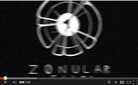 After having completed our first cut of our film opening we noticed a number of things that we are not entirely happy with and want to change. Firstly we decided that we want to replace the logo at the beginning as it looks out of focus and unprofessional. A second element we decided
  to replace is the film name at the end, because it doesn't capture enough attention and is a bit plain. We also noticed that the sound isn't particularly high quality and the continuity is bad so we plan to add in sound affects and mute certain tracks to fix this. We also feel looking at the first cut that we would greatly benefit from a soundtrack to ensure attention is captured and held and to aid the build of tension. Our first cut is also a few seconds too long so we have decided to cut the scene of the girls walking down the hill. We though
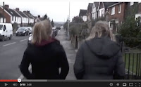 this would be the best scene to cut as the filming is unsteady and has an amateur feel to it. A further element we noticed that needs adjusting is the clips in the woods at the end. These were filmed on a different day to the rest of the footage and therefore there is quite a noticeable colour difference between some clips, affecting continuity. In order to get rid of this we will need to adjust the colour on the clips in iMovie. Finally we need to add in credits in order to meet the specification for our film opening.
Monday, 8 April 2013
Sunday, 7 April 2013
Raw footage
This is the majority of our raw footage we shot. We selected elements from all of this to include in our final film opening.
Saturday, 6 April 2013
Friday, 5 April 2013
Thursday, 4 April 2013
Wednesday, 3 April 2013
Costume Planning
Kira (main character):
White top symbolises innocence and purity. Casual clothes makes her relatable to the audience. Hood needed for thunder scene.Typical clothing worn by teenager to emphasise the young age.
Emily (friend):
Casual, every day clothes to make her relatable to the audience and appear as an every day teen.Coat on to emphasise bad weather setting the atmosphere.
Oliver (stalker):
All black clothing worn symbolising danger and death. Virtually all skin covered to emphasise anonymity and unknown identity.
Tuesday, 2 April 2013
Monday, 1 April 2013
Sunday, 31 March 2013
Saturday, 30 March 2013
Friday, 29 March 2013
Interviews on psychological horror
Questions asked:
- What do you find psychologically scary?
- What locations do you find scary?
- What characters would intrigue you in a psychological horror?
- What sound affect you most, psychologically?
- Do you think the use of violence in a psychological horror film is effective?
- What is your favourite psychological horror film and why?
Thursday, 28 March 2013
Final Logo
This is the final production logo, I drew the Logo design then scanned it onto a PC then uploaded to paint where I inverted the colours, I felt this gave the logo more relation to the genre as the black surrounds the white.
Drawings:
Drawings:
Wednesday, 27 March 2013
Logo Drafts
These are sketch designs for the ZonFilms logo, for these designs I have looked at themes of horror connecting with the eye, as the eye is considered the 'window to the soul' a lot of emotion can be expressed by it. I wanted to make the logo are representation of what impact horror films have on the audience, when the audience is watching the film they will see images that will make them feel uncomfortable and want to turn away. So in my logo drafts we can see images of the eye being inflicted by 'needles' or having a sharp edegs incorparated. Our production name 'Zon Films' has evloved from the word zonular that is the part of the eye. I wanted to make the production name relatable to the logo and I also felt it had a abstract and sureal sense to it as it begins with the letter 'Z' with has a latin refference to 'Devil'
By Oliver Endersby
Tuesday, 26 March 2013
Logo Research
For the
production logo I decided to research other logos from popular Horror film
industries, This includes companys such as Lionsgate, Woodshed and Hammer
films...
Looking at these logos I
noticed that there colour scheme consisted of dark reds and blacks linking to
the themes of horror (ex. blood, darkness & death) The Lions gate logo has
a texture that makes it appear to have a metallic appearance, this links to
metallic objects such as weapons and machines making the logo appear threatening.
The red clouds behind also contrast the text and make it more distinct. The
Hammer Logo is simplistic using the similar colour scheme yet effective font
that gives the ‘H’ sharp ends that can be reference to fangs (the company was
the studio for the 1953 production of Dracula). The Wood shack logo is clever
in the way it incorporates the logos name within a simplistic image. The
letters ‘W’ & ‘S’ are represented as blanks that create the image of the
shack. This logo uses a black on white that distinguishes the cracks and
‘sketch’ effect of the shack.
By Oliver Endersby
Monday, 25 March 2013
Target Audience Research
From our target audience research we can establish that out target audience, people of ages 15-20, generally like the following:
- Psychological horrors
- Teenage/young characters
- A female main character
- An outdoor setting such as the woods
- Do not feel violence is necessary to enhance a horror film opening
After discovering this we will try to include these elements in our film opening so we suit our target audience as best as possible.
Sunday, 24 March 2013
Using Tutorials
In order to actually create our horor opening we as a group had to use a programme called 'imovie', the programme imports video footage that we had filmed from the camera/memory card to the mac and allowed us to edit the raw footage into our final piece 'Shutter'.
To make the sound track for our horror opening we had to create a peice from scratch due to copyrigt issues, this meant using a programme called 'garage band'.
As none of the members in our team have had to use these programmes before we had to do reasearch into how to use them effectively. One of the ways in which we dd this was to watch tutorial videos of the programmes on youtube and follow instructions as best we could. This was a very effective and constructive way to become familiure with the softwear as we all very quickly became comfortable using it in our every day construction of the horror opening.
Saturday, 23 March 2013
Camera shot requirements for a psychological horror film
There are a number of standard
approaches used in order to create the scene, mood and atmospheres of a typical
psychological horror film .In order to capture this we needed to mimic the same
camera shots and components in our opening 'shutter'. Below are the main techniques
we used with an explanation of how and
why they are appropriate.
An Extreme Close Up - This
is used to emphasise something, and focus on particular details in our opening
we use this type of shot to zoom in on the main characters face to show her
pure terror as it dawns on her that she is being followed, it allows us to see
clearly the emotions she is feeling.
ECU's have a dramatic effect, and can cause the viewer to feel some discomfort
to add to the excitement and intensity of a scene.
Long shot - This is a shot by which the whole setting fills the
frame. This shot is often used so that the audience can establish what the
setting is and emphasise the background and surroundings. This shot is often
used in horror films to create atmosphere and tension and to also inform the audience
of the creepy setting by which the scene is going to take place. We used
this to film the main character walking home from school taking pathways that
run through woods. We used it to show her as isolated and vulnerable in a potentially
hazardous setting.
High angle shot- This is when the camera is above the character/action looking down on what's
happening, this makes the viewer feel more powerful than the character. We used
this shot when it dawned on the main character that she was being followed and
pictured, the shot also makes the character seem harmless and insignificant and
as a result vulnerable. High angled shots are sometimes referred to as the
'victim shot' and are sometimes used to end a scene the same way in which we
did in our opening.
Panning- Panning is when the base of the camera remains still while the camera
moves from left or right or vice versa, a following pan is used to follow a
moving object from the side view and we used in the same shot the long shot to
follow the main character waking thought the dodgy paths. The speed of the pan
establishes and creates a particular mood.
Hand held camera/ steadicam- a hand held camera shot is used to
produce a jerky unsteady shot, which we used when we shot our main character being
chased through the woods. This type of shot can be used to intensify a scene of
violence, steadicams allow fluidity in tracking, so that actors can be tracked
while walking up stairs, riding motorcycles ect, and in our case being chased.
Friday, 22 March 2013
Subscribe to:
Comments (Atom)


